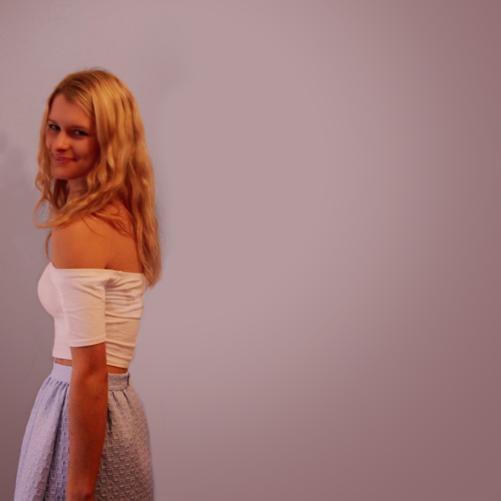
For this image I was very conscious that it must fit in with the other images, so I used a filter to compensate for the lack of pink shades in the image. I have prepared the background so that the middle section (where the text will be) is faintly illuminated. This will attract attention to the track list.

No comments:
Post a Comment