I
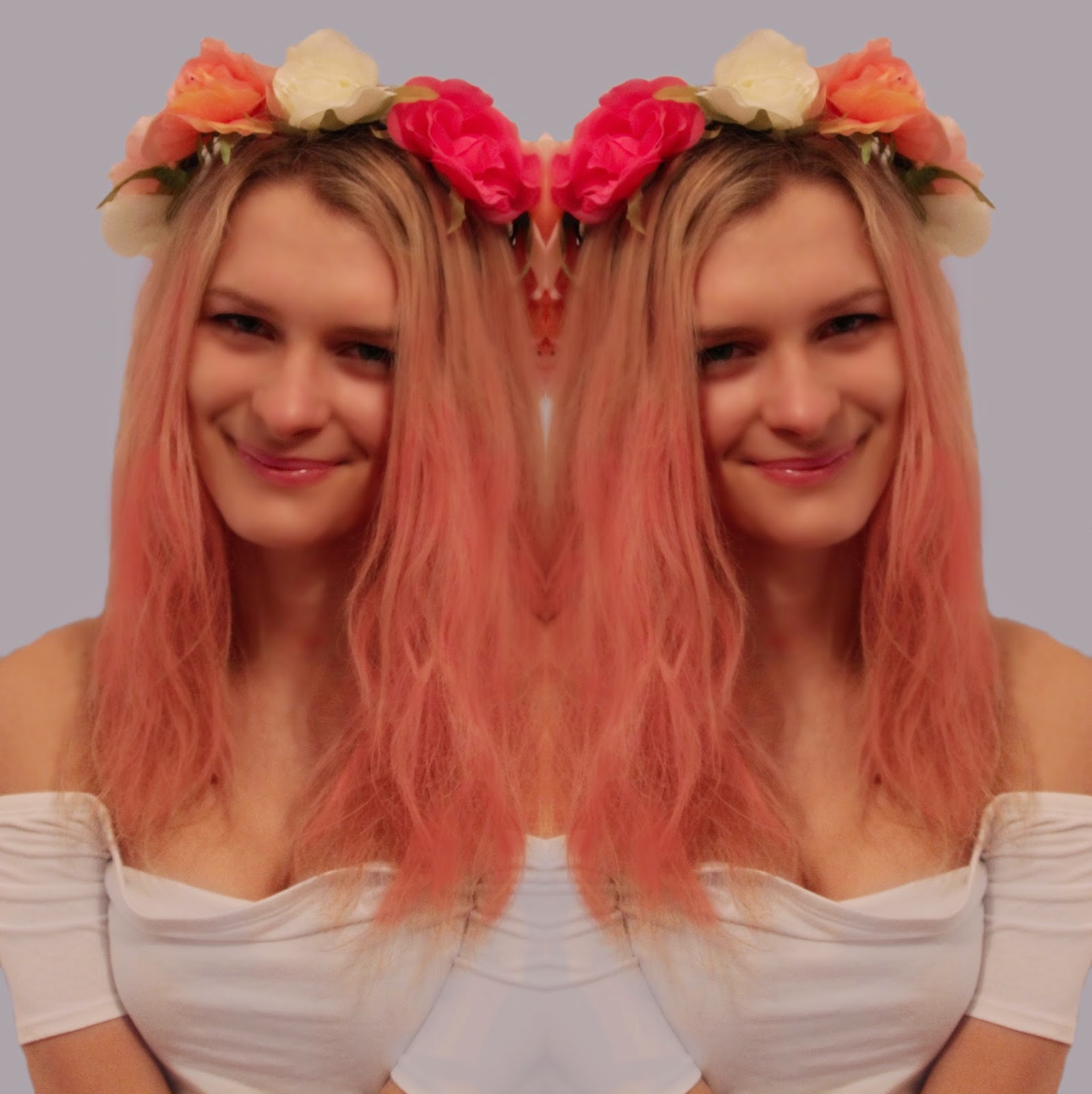
have finished editing the image for my album cover. The biggest changes I have
made have included cropping the image into a square and making it much more
vibrant. I think that it is now ready to add text.
I
have edited this image and cropped it to a 3:4 ratio, to then duplicate the
image and horizontally flip the clone. This has given a mirror image effect
which I think looks really unique and quirky. This suggests that Palmer’s music
is special. Furthermore the heads together in the finished product have a vague
look of a heart shape. This is very subtle and many people probably will not
notice this, but it assists in making the image look delicate.


No comments:
Post a Comment