This link will take you to my evaluation blog.
Sunday, 14 December 2014
Saturday, 13 December 2014
Finished Back Cover

Using lots of audience feedback, this is my finished product
for the digipak back cover. I have decided to use white text because I think it
is complimented by the white in my artist’s top. I think that the border gives
a window effect, as if the viewer is looking into her life. However the fact
that the border isn’t completely opaque reduces this ‘barrier’ between the
artist and viewer. I added the barcode, logos and text on the right to give the
back cover a more porfessional look.
Finished Disk

This is my completed album disk. I am really happy with how
the image looks and how well it works weighted to one side. While it is somewhat
unusual for the artist’s face to be on the disk, it is not entirely rare and I
think that this works effectively for my artist. Because most disks are very
simplistic, I didn’t use text to keep mine fairly plain too. I don’t think it
needs the artist’s name/album title on the disk because the image so evidently
pairs with the digipak case. Furthermore by not including text, the disk, to a
certain extent, suggests that text is not needed; the viewer should recognise
my artist. I also think that the eye contact is really effective in drawing the
viwer’s attention.
Back Cover Audience Feedback

I became unsure which of my back covers looked the best, so I
used Facebook to gather some audience research. I sent the options to teenage
girls fitting my artist’s target audience so that the feedback was appropriate
and relevant. In general they liked my edits, and the most popular was number
6. I have used a pie chart to clearly reflect my findings- whenever the image
gained positive feedback I gave it a point. I found this process really helpful
as it was a very easy way to share my ideas, as I was given plenty of unbiased
opinions. Therefore I will continue working on the 6th edit.


Completed Magazine Advert

I
am really proud of how my magazine advert has turned out. I used the artist
name (which is also the album title) to draw the readers’ attention by making
it very large and stark white. Then the font around the image brings the reader
down to the bar in the lower third, where I have used a rejected cover design
as a deluxe version. I think this works well as it was the favourite design,
but wouldn’t work in attracting casual fans. The deluxe album is most likely to
be bought by dedicated fans, would wouldn’t really need the clarity of the
white font. Furthermore the deluxe edition would be released after the
original, so people would likely be familiar with the image.
I
gave some of the text a slightly transparent appearance because I think it
looks very delicate and attractive, suiting my artist’s image. I have also
created synergy with the album in many ways, including-
-
Images
from the digipak, most obviously the main image is featured on the disk. The
hair in particular is very noticeable as reflecting the album.
-
I
have again used the Riesling font,
with ‘Lily Palmer’ having a similar effect with double lines.
-
The
colour scheme is the same with a dominant use of pink, and white text. The other
text is also the same colour as the text on the deluxe album.
I
also decided to add a website and twitter handle to help viewers to find out
more about my artist and her music. The twitter handle particularly appeals to
Palmer’s technology-savvy, social network loving target audience.
Friday, 12 December 2014
Album Cover Options

When
editing the album cover, I found it difficult to choose between some options.
Therefore I asked for feedback from teenagers. They didn’t like the text at the
bottom of the image as it covered the face, and preferred versions without a
white border. The general consensus was that the design in the top right was
the favourite, however the text did not stand out enough. They found that the
doubling up of the text make the name/album title stand out.
Thursday, 11 December 2014
Back Cover Image
For this image I was very conscious that it must fit in with the other images, so I used a filter to compensate for the lack of pink shades in the image. I have prepared the background so that the middle section (where the text will be) is faintly illuminated. This will attract attention to the track list.
Wednesday, 10 December 2014
Disk/ Magazine Advert Image

This
is my final edit of this image before editing separately for the disk and
magazine advert. I have decided to use a filter to get this subtle pink effect.
I really like how this compliments the pink shades in the image, and contrasts
with her green eyes.
Album Booklet Image

I
have finished editing the image for my album cover. The biggest changes I have
made have included cropping the image into a square and making it much more
vibrant. I think that it is now ready to add text.
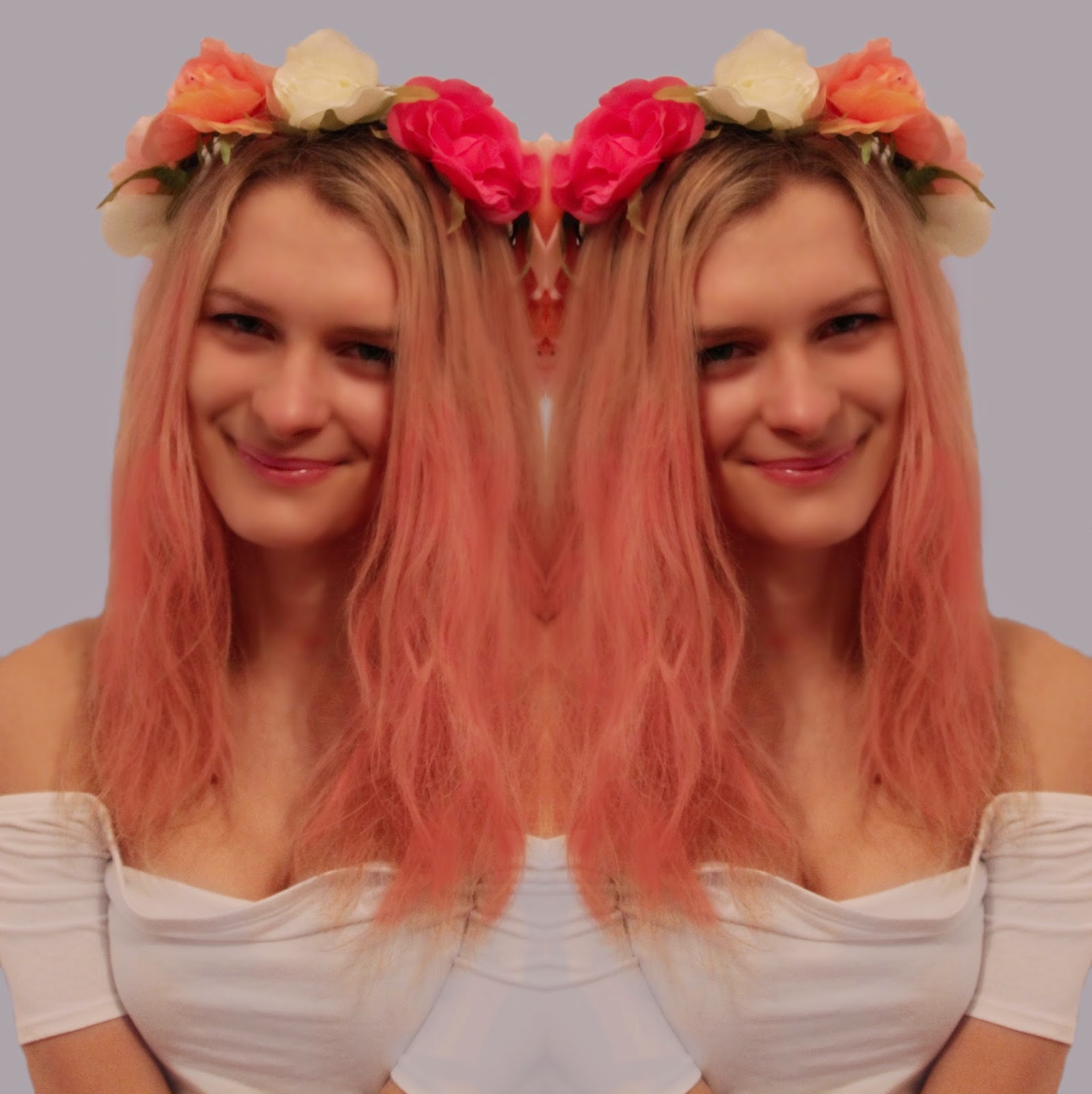
I
have edited this image and cropped it to a 3:4 ratio, to then duplicate the
image and horizontally flip the clone. This has given a mirror image effect
which I think looks really unique and quirky. This suggests that Palmer’s music
is special. Furthermore the heads together in the finished product have a vague
look of a heart shape. This is very subtle and many people probably will not
notice this, but it assists in making the image look delicate.
Tuesday, 9 December 2014
Album Cover Image

I
have finished editing the image for my album cover. The biggest changes I have
made have included cropping the image into a square and making it much more
vibrant. I think that it is now ready to add text.
Friday, 5 December 2014
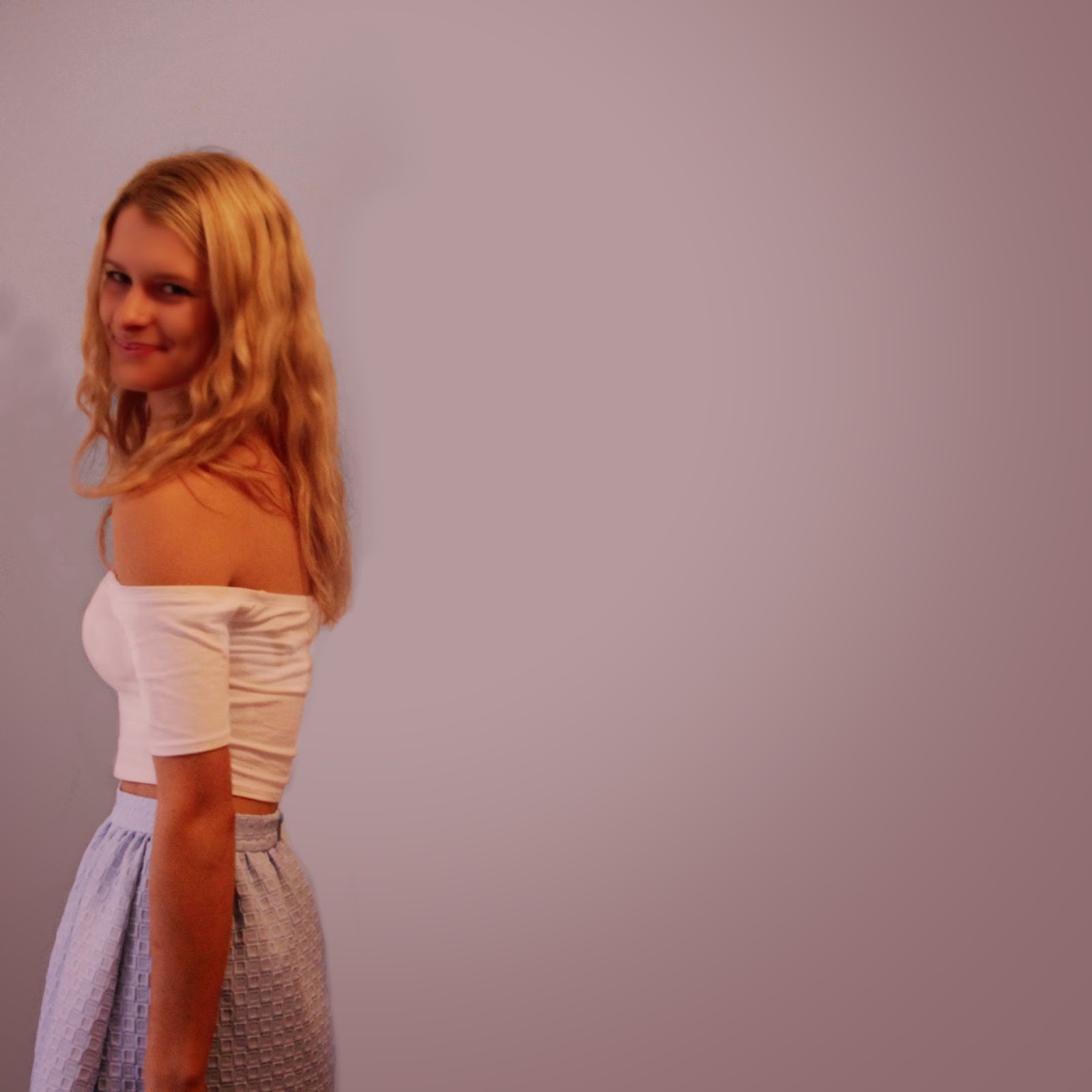
Chosen Back Cover Image


I have decided to choose a slightly distant mid-shot in order to show my artist’s outfit. This will appeal to my target audience, most of which are interested in fashion and enjoy shopping.
Photoshoot 2 Response

I
have also asked female teenagers to rate some of the photographs from my second
shoot. These were the most popular. This gives me a clear idea of what my
target audience is looking for in the back cover. As I hoped, the two favourite
images feature my artist facing side on, so I will produce a back cover very
similar to my design.
Thursday, 4 December 2014
Chosen Inside Booklet Image


Chosen Disk and Magazine Image

Due
to its popularity I have also decided to use this image. I firstly thought it
would work for the disk as it is a little different as she isn’t quite smiling,
yet it also links closely to the other images, creating synergy. Furthermore
this shot looks a lot more natural as her expression is very relaxed. It also
looks slightly more grown up, and the fact that she looks as though she is
about to begin talking creates a sense of intimacy.
The
unique look of this image is why I have also decided to choose it for the magazine
advert. It will attract attention because it is interesting, and the ‘eye
contact’ will draw the reader in. Furthermore I wanted to use a different image
to my album cover, as I plan to have the latter feature on my magazine advert. Lastly I think this image will work well with both a circular crop (for the disk) and a landscape rectangular crop (advert).
Chosen Album Cover Image

As
it was the most popular image I will use it for my album cover. Think is the
image which will be seen the most, and is arguably the most important. I think
that the picture works so well because it is a close-up of the artist,
suggesting a sense of familiarity. The facial expression is also very friendly
and welcoming. I will use photoshop to edit this photo, with the aim to make it
look more sophisticated and professional, and add text.
Photoshoot 1 audience response

Monday, 1 December 2014
Abum Back Cover Photoshoot

For this photoshoot I chose for my
artist to wear the same outfit as the first. I also kept her make-up natural. I
did this to create synergy between these images and the others, in order for
the back cover to not look out of place. I planned to use an image of my artist
facing the left, and despite taking other shots I still think that this will
work well.
These images contrast with the other
shoot as they aren’t as vibrant, and I think this will work well to represent a
down to earth side of my artist. This will appeal to my target audience as they
are looking for a role model.
Album and Magazine Photoshoot

Here are some images from the photoshoot
yesterday. I will choose from these images for the album cover, booklet, disk
and magazine advert. I have decided that for the back cover I want a mid-shot
with Palmer’s hair a more natural shade of blonde. I think that firstly this
will add some variety to the products. It will also give the viewer a more
relatable representation of my artist. I will therefore do another shoot this
evening to produce a suitable image.
I think these photographs work because the pink from the hair and headpiece adds a pop of colour. The colour scheme is appropriate for my artist and the pop genre as it is feminine and bright. Furthermore the flowers reflect her name; Lily and Palmer both denote plants. I also think these close up shots work well as the focus is completely on Palmer. I also chose the images with happy facial expressions as I think these give the vibe I was after; these shots are very light-hearted.
I think these photographs work because the pink from the hair and headpiece adds a pop of colour. The colour scheme is appropriate for my artist and the pop genre as it is feminine and bright. Furthermore the flowers reflect her name; Lily and Palmer both denote plants. I also think these close up shots work well as the focus is completely on Palmer. I also chose the images with happy facial expressions as I think these give the vibe I was after; these shots are very light-hearted.
Subscribe to:
Comments (Atom)